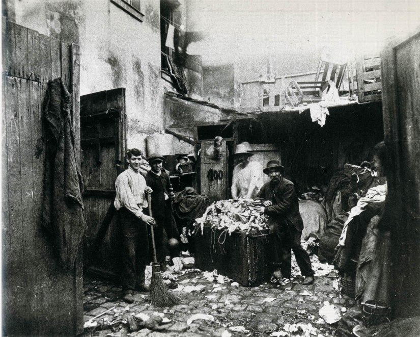
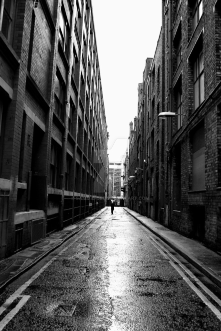
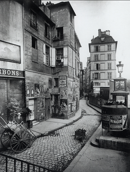
| | Eugene Atget's photography caught my attention because of the variety of movements he shows in his work. I real admire his use of value as well. In a lot of his photos there's both enhanced shadows and highlights which I figured would look "tacky" in a piece of art, but he made it work. In the first photo he included both clutter and enhancement in his highlights and shadows. I think this photograph out of the three is my favorite because it hold a little bit of humor which I admire in photography. It seems as if Atget took the photo when no one was looking and then once the people saw him they stopped immediately and posed for the camera. The man's reaction (in the center) gives off this "feel" that made me smile. In the second photograph he used symmetry to his advantage and the lighting is ever-so breathtaking. The light that reflects off of the seemingly damp ground draws the eye towards the figure that breaks away the symmetry. The last photo I found interesting because of it's movement with the road and the house's positions. This photo shows perfect composition with texture, movement, value, and pattern. By showing off the clutter, he's used it to his advantage to create a unique composition and a beautiful piece of art in not just this photo but all of his. |
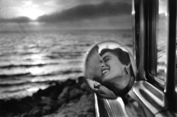
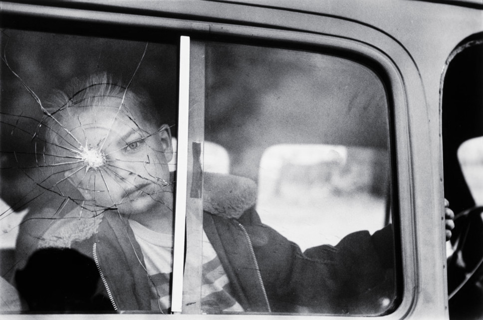
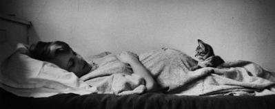
| | Elliott Erwitt's photography is definitely my favorite out of all three of the artists I chose. He's captured not only personal but some extremely powerful images that speak for themselves. A lot of his photos are in the rule-of-thirds which gives off a "balanced" feel to each photo such as the second one. By placing this child exactly on the left side of the photo, he's forced the viewer to black out and pull away from the other side. The fact that there's a crack where the child's eye is, we can assume he's attempting to create a message maybe of power or loss of. Both photo number one and three show his use of the empty space to his advantage so that the subject is more so focused on by the viewer while the background is there only to reflect off of the main subject and add balance. The third photo shows this more than the first because the blank space is actually "blank." By laying down his subject, he's created a "comfortable" feel to his photo and by having her look down at her pregnant stomach, this gives off a "warm" feel. Going back to the personal side, photo number one shows this exactly. He's placed the photo in the rule-of-thirds which allows the viewer to focus on the subjects. The fact that there's a sunset and the couple is kissing gives the personal feel which is a beautiful and amazing skill to show. |
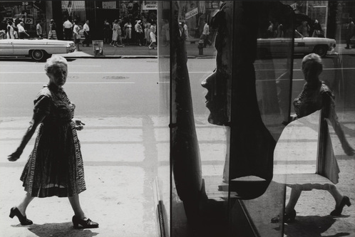
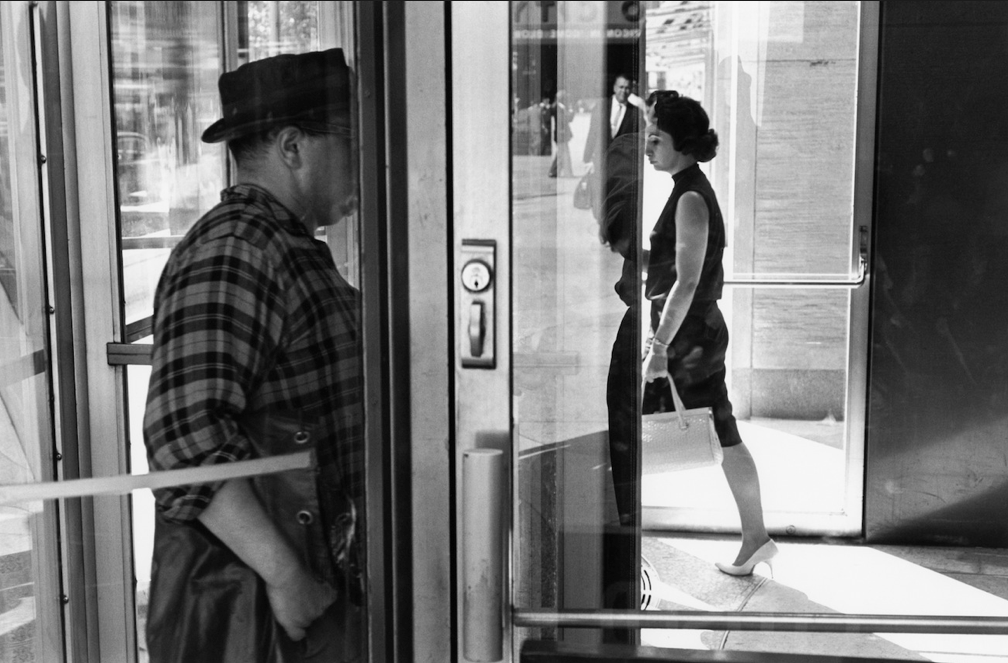
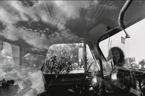
| | Lee Friedlander's photography is somewhat of "typical" from a street photographer but he adds his own twist by using reflections of the subject he's photographing as well. Doing so, it shows some double exposure that's appealing to the eye and also enough to look at. For example, photo number three shows both the car and the clouds. The way he positioned the two subjects, allows somewhat of a balance to the photograph so it's not too "botchy" such as, there's clouds and then there's an interior of a car. The photo flows, which is what each of his photographs depict. Sometimes double exposure can be too much on the eye, however, Friedlander's work isn't too much but it also isn't missing anything. By placing most of his subjects in the rule-of-thirds, it gives his work an appealing image that can be both powerful but also even emotional. |